Gridshare is a software offering from Lunar Energy that is used to optimise the charging of distributed energy resources in the home. Identifying a homes energy generation and consumption patterns and generating personalised plans to match a households needs. As well as creating virtual power plants in which homes can dispatch energy back to the grid.
The brief
Matt Jones set me the task of developing an engaging visual identity for Gridshare that was able to grow with the software as new features and capabilities were developed. The challenge, identifying an effective way to visualise a complex interconnected fleet of homes and devices in a way that resonates with the people using them. While doing this in a way that can be used across all Gridshare’s digital and physical communications.
How do we visualise Gridshare?
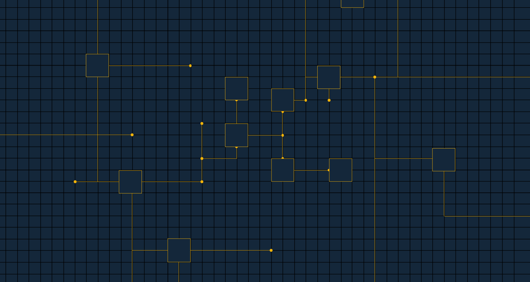
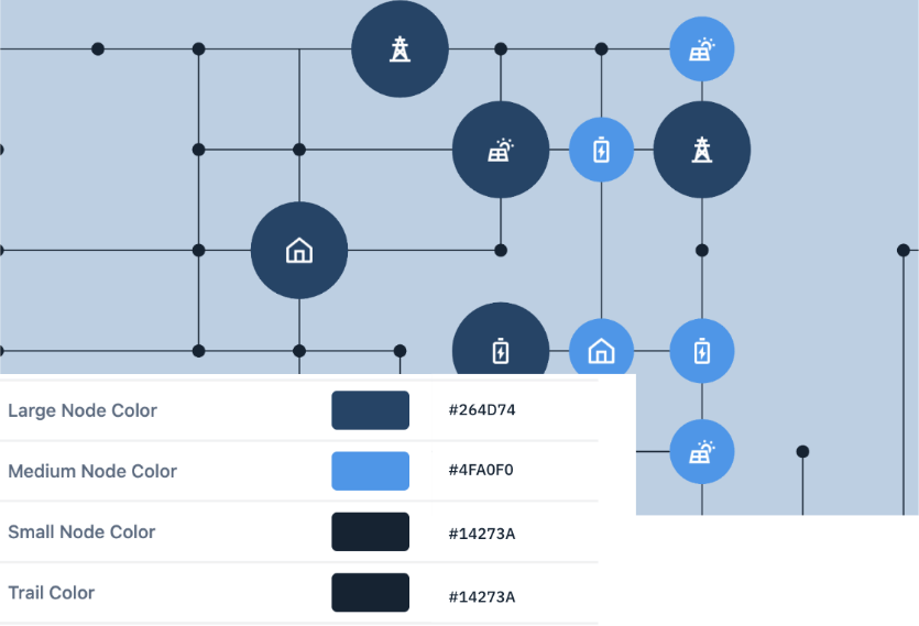
Thinking of Gridshare like a circuit board
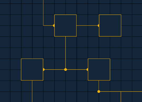
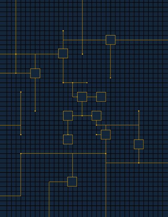
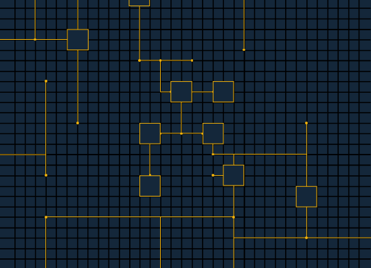
All the homes and devices managed by Gridshare are connected to one another giving the ability to participate in virtual power plants. Imagine a dynamic circuit board with new components being added and new connections being formed.
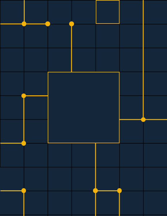
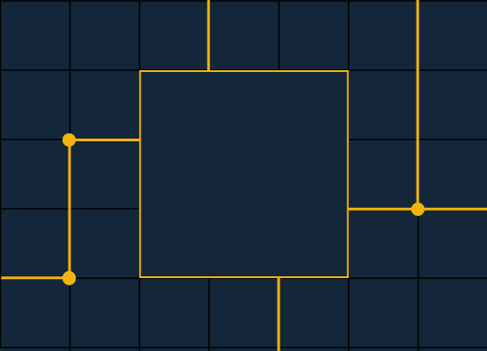
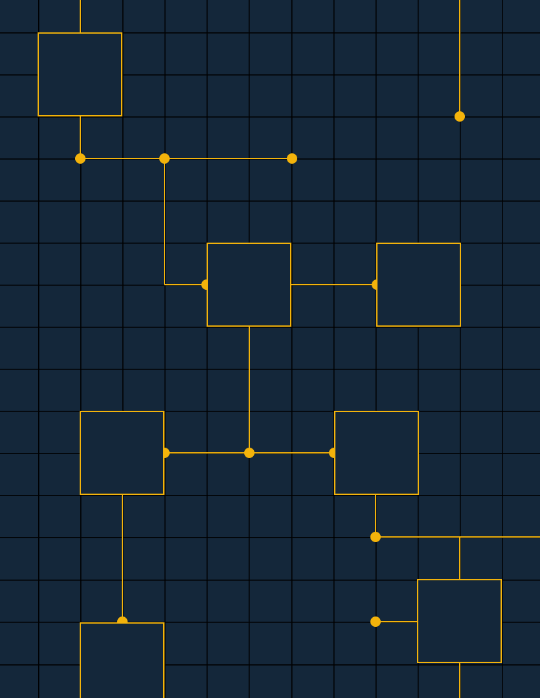
But, how would we visualise the system as a whole, parts of the system, or individual components? The idea was to use scale to do this, zooming in on individual components or parts of the system that needed to be visualised. Using a grid system to ensure visual consistency across all outputs.
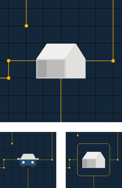
A single component
Part of the larger system
The system as a whole
How do we visualise individual components of Gridshare?
Looking at the components of the system
Taking existing illustrations and iconography used across Gridshare’s current identity work in order to explore different ways that the individual components could be visualised. The goal to create a clear and easily understood method of visualising these components that resonates with the audience and can grow with the software. Settling on the brands iconography to do this.
How do we output quickly & consistently?
Creating an output tool
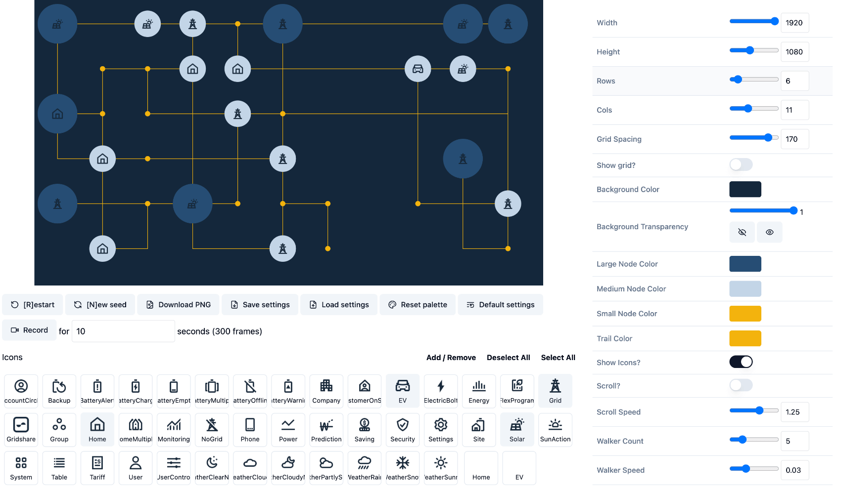
Having sat down with Matt to discuss current progress, it quickly became apparent that the best way to create quick consistent outputs was to create a tool to do this. I went away and drafted an initial version of the generator tool using p5.js, something I hadn’t picked up since university. It lacked customisation and dynamism but worked as a proof of concept, allowing quick png exports and random yet consistent outputs created on a grid that could be adjusted to different use cases.
We partnered up with Tom Armitage to take this concept to the next level. The static outputs were struggling to portray the dynamic nature of Gridshare, we needed motion in order to show this. Tom developed this along with extra levels of customisation for: colour, icons, ability to scroll, and number of components. But most importantly, the ability to output statics or image sequences which could be stitched together to create animations.
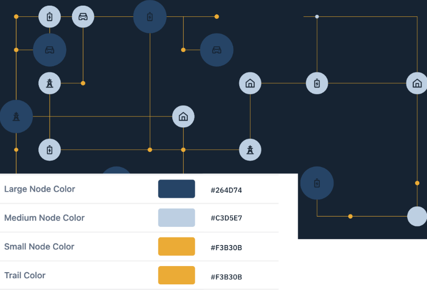
The outputs were great but with this level of customisation we needed to implement some rules around colour usage to ensure consistency. To do this I put together two skins for the generator to use, a dark and light, ensuring visual appeal no matter the placement, while maintaining a consistent visual identity.
Humanising Gridshare
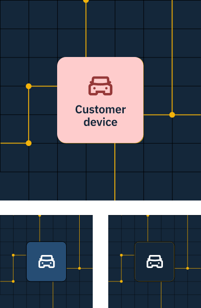
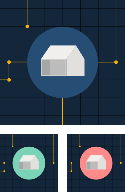
Show the beneficiaries of the tech
One question remained, how could we create connection between the visual outputs and the people benefiting from the technology? Portholes. In post using After Effects I added zoom animation to components of the visualisation creating connection with the people interacting with components of Gridshare. Humanising Gridshare allowed us to connect brand Lunar to brand Gridshare. Showing the beneficiaries of the tech, not just the tech.
How do we apply this work to Gridshare’s digital and physical collateral?
The new visual identity
Having created a quick method of outputting Gridshare visuals we needed to explore how these visuals could be applied across all Gridshare’s marketing material. The goal to create a consistent visual omnichannel presence that connects with the tech with the people that use it, whether that be the website, social media, user manuals, and video content. First, I worked up a new hero for the website.
Then, exploring how it could be applied to video content used to help explain the software in more detail. These videos often contain speakers, stock footage and the use of captions. Overlaying the visual on top of stock footage or video allowed us to make it feel like Gridshare’s own enabling a quick production process for marketing team members.
Standalone
Speakers
Captions
Stings
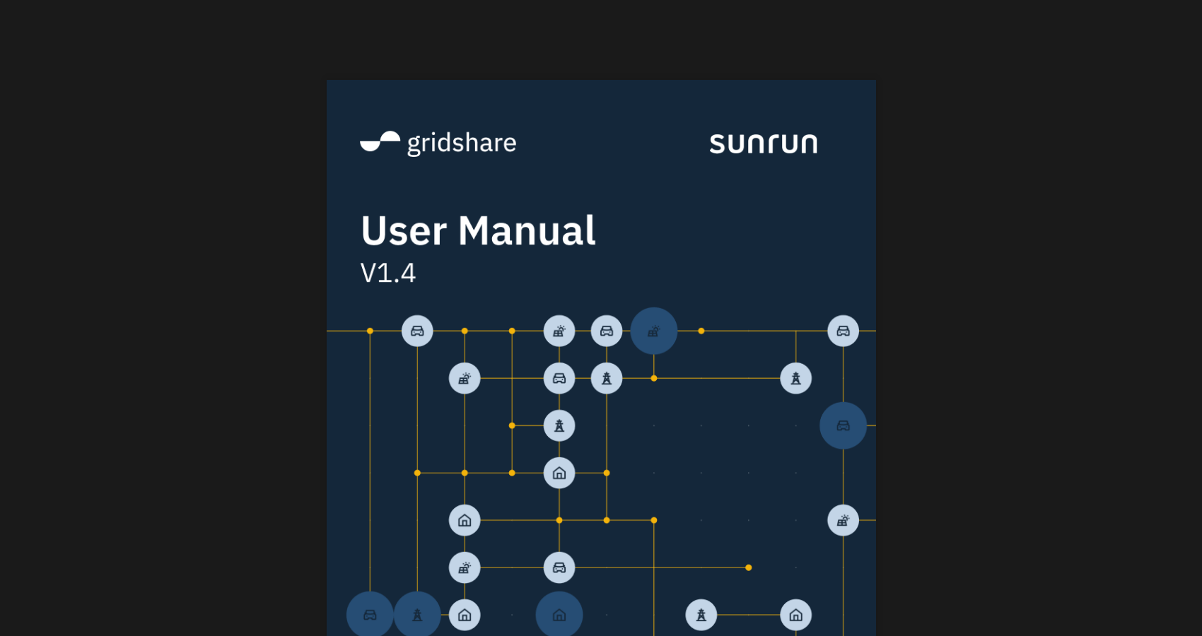
Static Imagery
Stock footage
Due to in built functionality of the generator tool we were easily able to output animations for portrait placements to be used across social media platforms. This allowed us to carry out any of the above treatments to reaffirm Gridshare’s visual identity.
Ability to output high resolution imagery also allows this visualisation work to be used for print. Gridshare has various print documentation to accompany its software which made it vital that its identity could be carried across to print collateral.