RNS
Chef cooked, healthy meals delivered to you.
Work carried out
Brand Identity
Marketing Material
Web Design
Packaging
Launched in May 2019
RNS is a family run business, started by founder Simmy in 2017 whilst at university, suppling healthy chef cooked meals to those who don’t have time to cook. Fed up of seeing students living off poor quality ready meals and takeaways, Simmy believed there was a huge gap in the market. Convenient food, made with high quality ingredients, which tasted delicious, and at affordable prices – it made so much sense yet no one was offering it!
RNS expanded rapidly proving popular with people that wanted to lose weight but didn’t have the time or knowledge to maintain a healthy diet on their own. The meals our selected via their website and delivered directly to your door, making the service incredibly convenient.
The brief
To help RNS bring clarity to its original vision and develop a new visual identity for the brand. Transforming its initial rough branding into a professional and premium brand in which all moving parts work in harmony.
Let’s see some ID
The new and improved logo
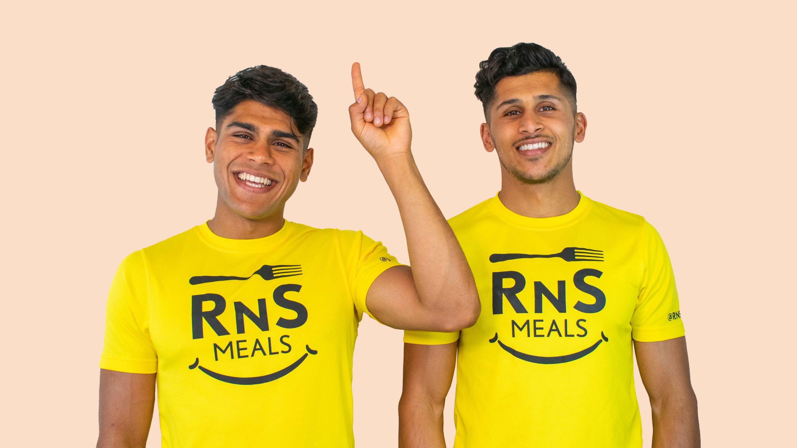
The new logo had to reflect both the brothers and the brand: healthy, passionate, energetic and friendly. People really connected with the two brothers story and the logo had to portray their personality.
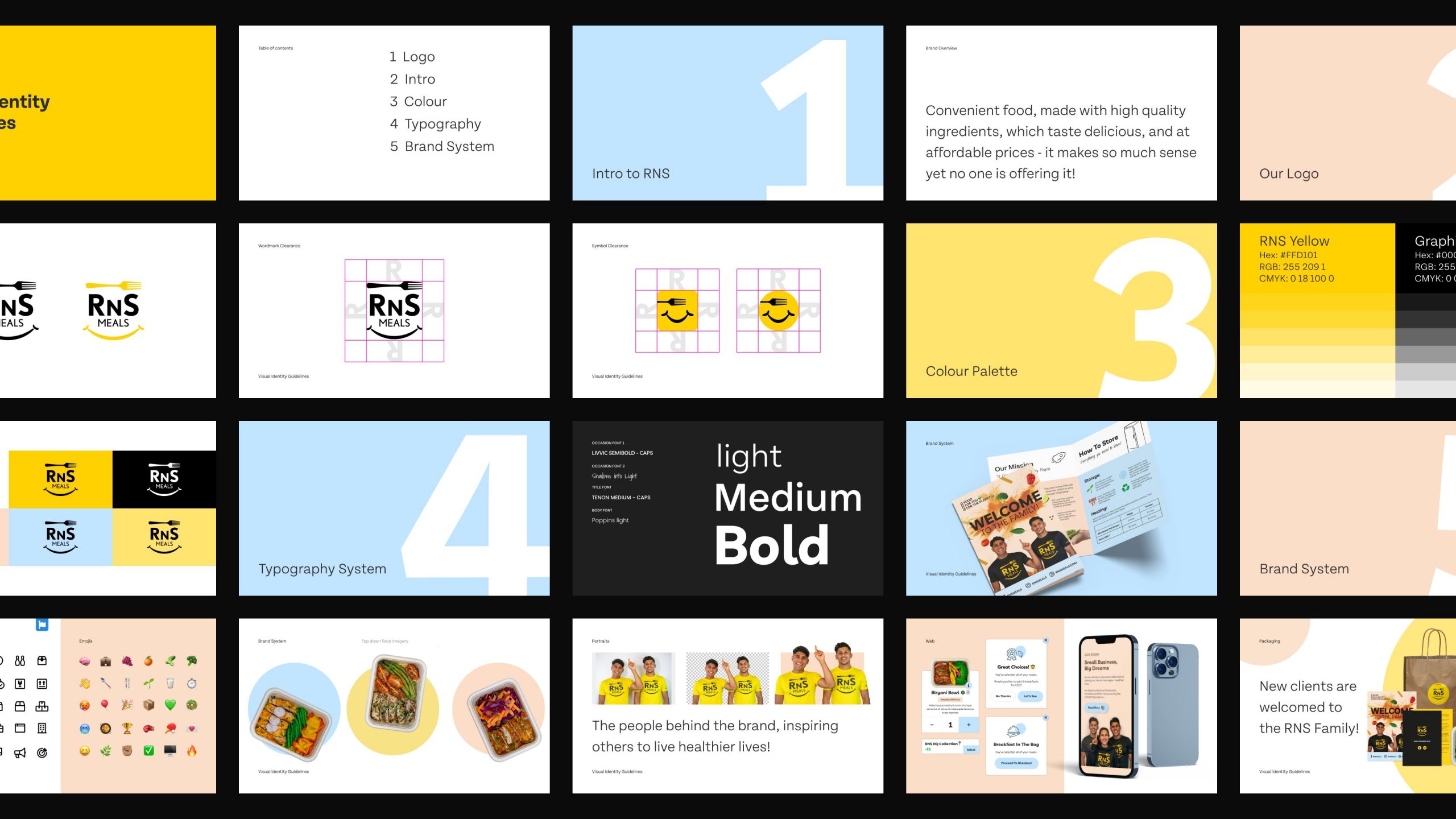
Elements of style
The building blocks of a brand
RNS’s style guide makes sure its robust identity – logo, colours, typefaces, icons, shapes, and all other little things shine through consistently in every situation, from packaging to website.
Award winning ingredients
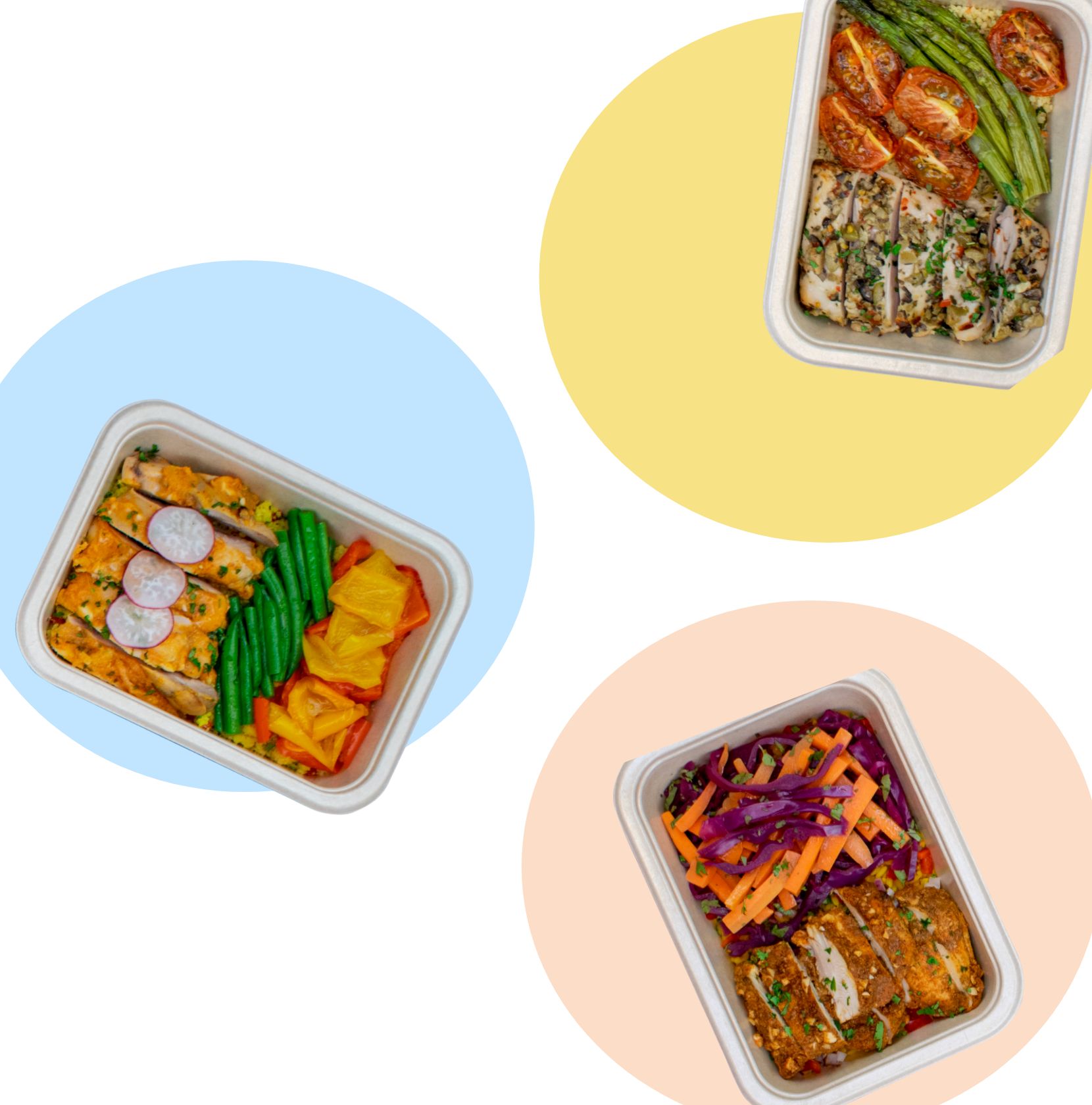
We source award winning fresh ingredients from local suppliers.
Chef cooked meals
All our dishes are prepared by our team of expert Chef’s.
Evolving menu
An ever evolving menu to ensure you never get bored.
Award winning ingredients
We source award winning fresh ingredients from local suppliers.
Chef cooked meals
All our dishes are prepared by our team of expert Chef’s.
A home for RNS
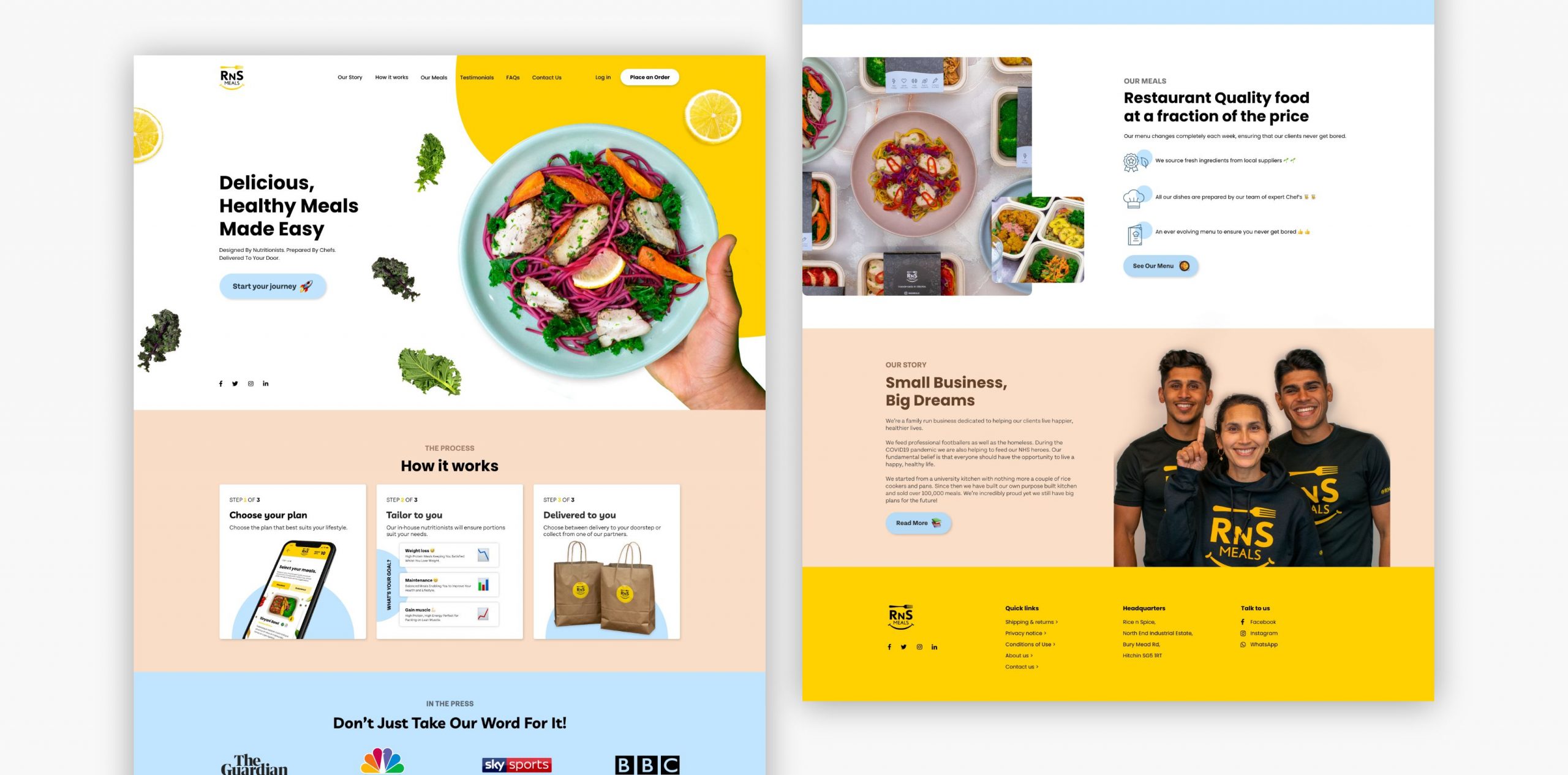
The new website
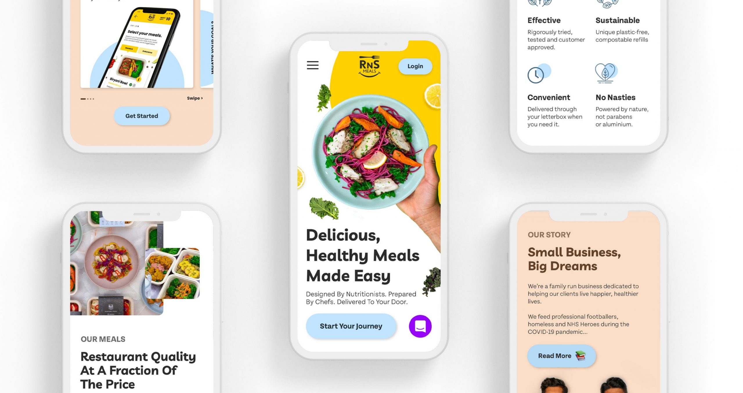
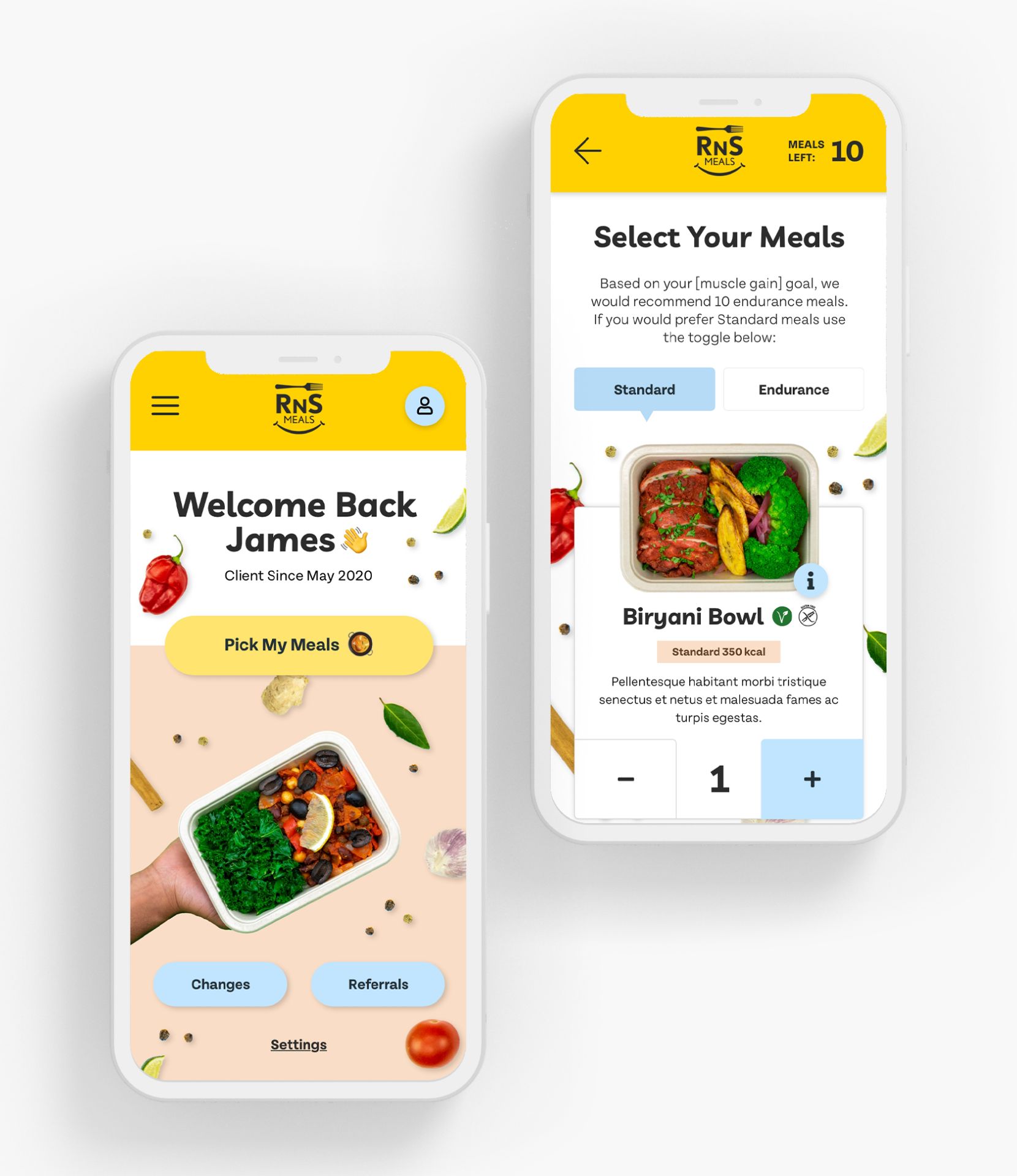
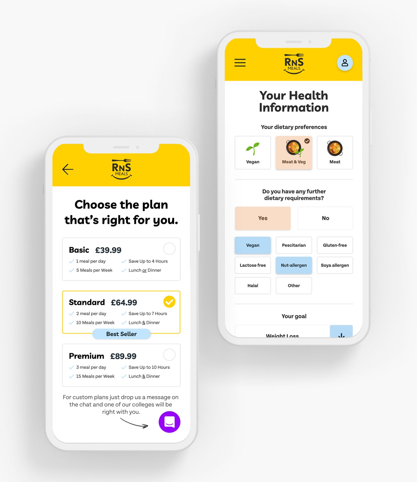
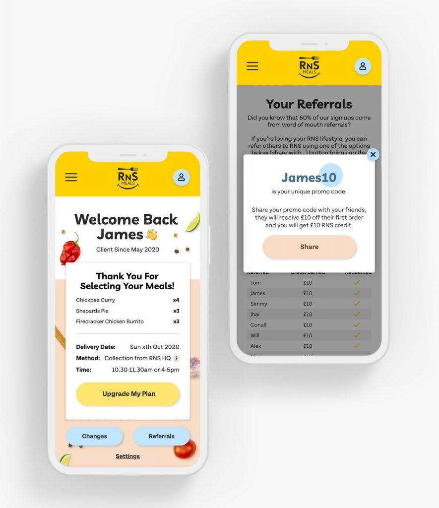
Because it involves so many elements, a website is often the clearest distillation of a brand. For RNS’s new site I focused heavily on the user experience both for new and existing customers. Ordering meals has never been easier!
Meals made for your goals
Improved UX for subscriptions
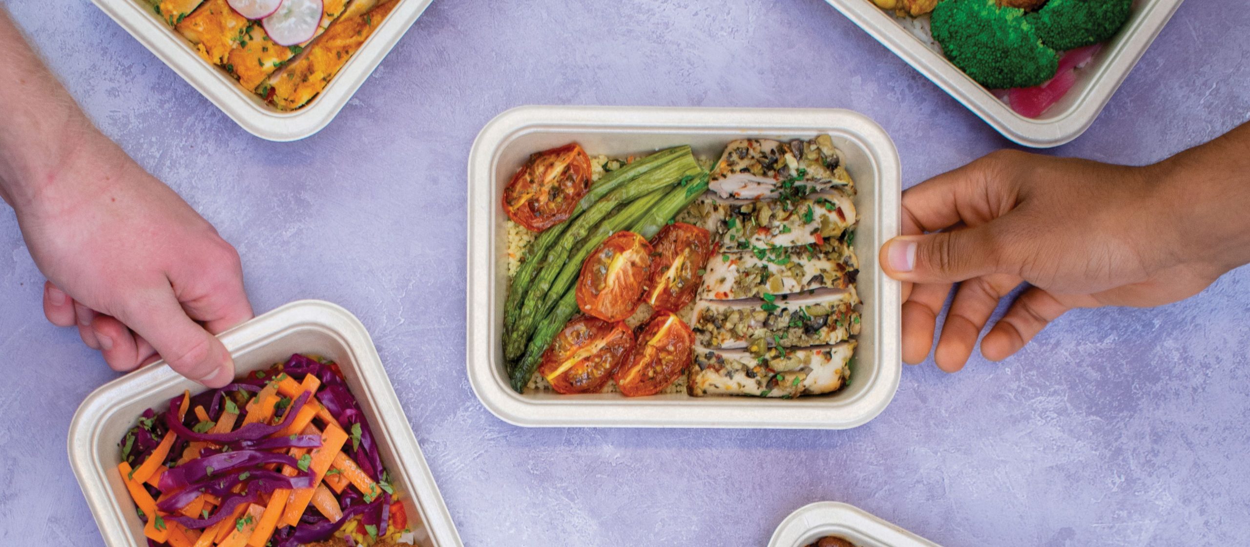
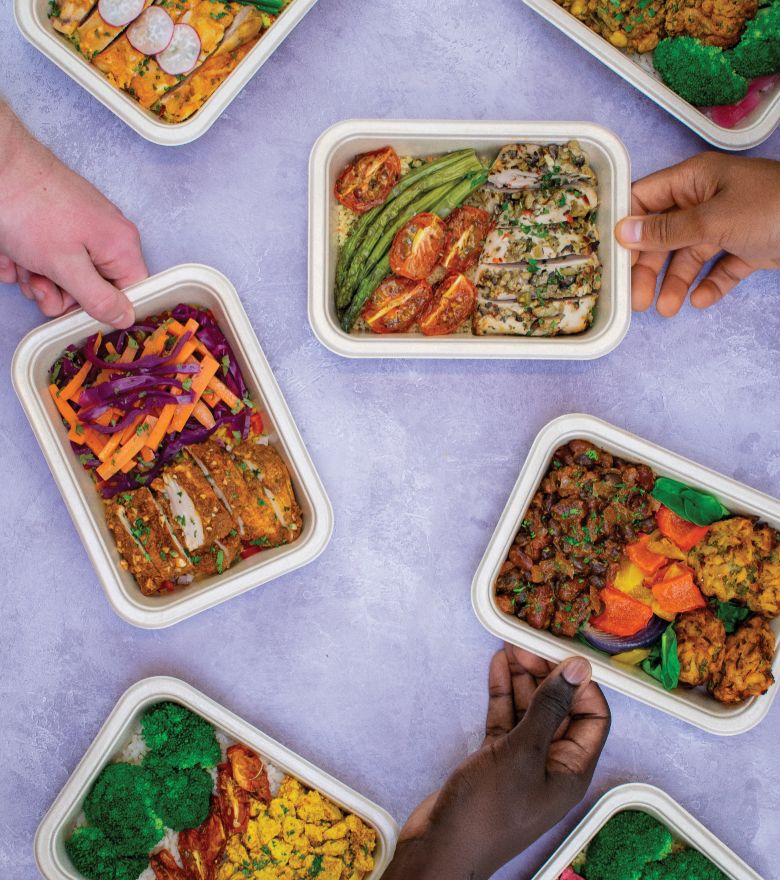
RNS creates customised meal plans based on clients’ health goals. Creating a user experience that allowed users to easily select meals on a weekly basis was vital. Presenting the meals in a visual way allowed users to see exactly what they would be receiving.
“The new website and brand shows customers how much we care about them living happier and healthier lives”
Founder, RNS
Premium feel
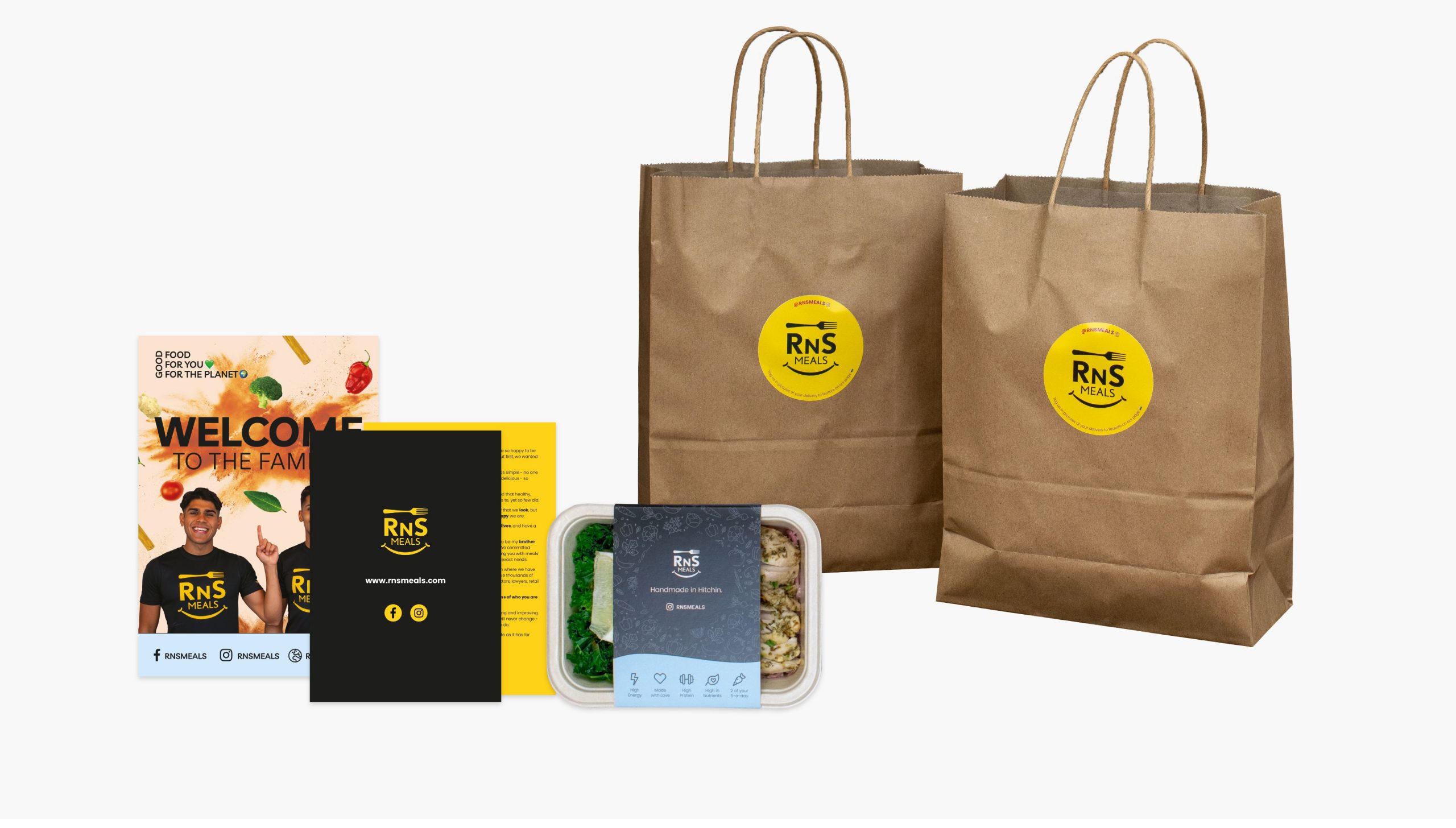
The new packaging
The user experience doesn’t stop once the meals have been ordered. The unboxing experience needed to be as enjoyable as eating the great meals that RNS make.
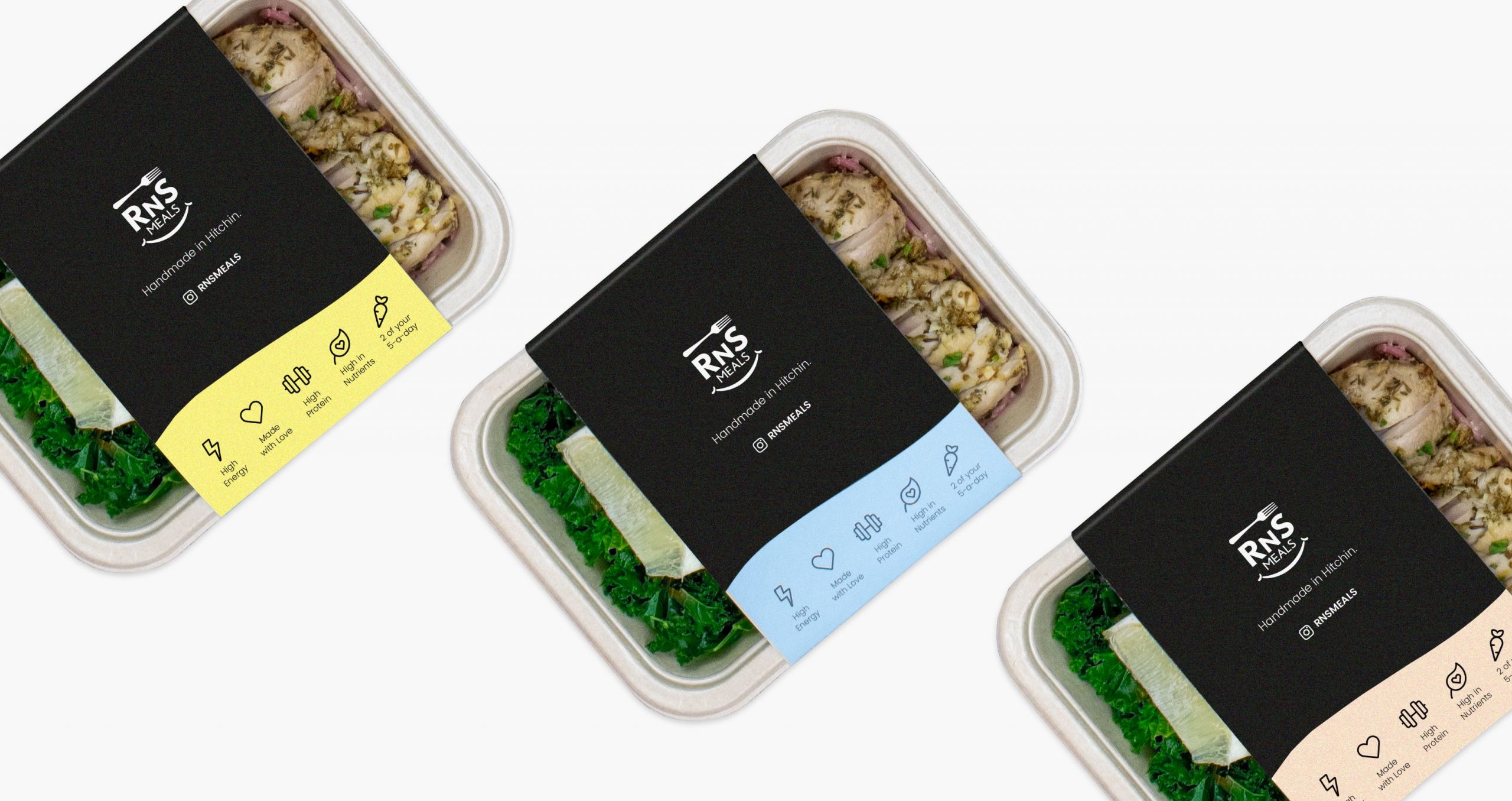
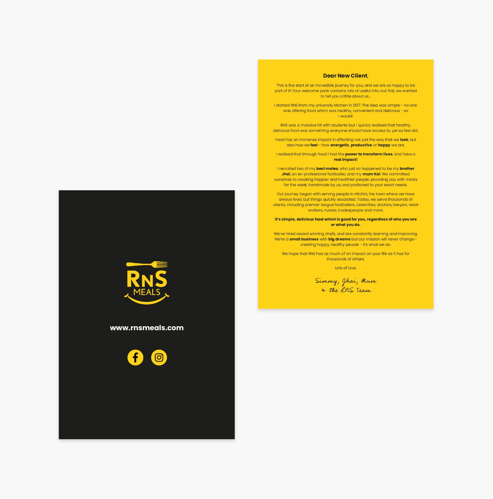
New clients receive a letter from the founders included in the their delivery welcoming them to the RNS family.
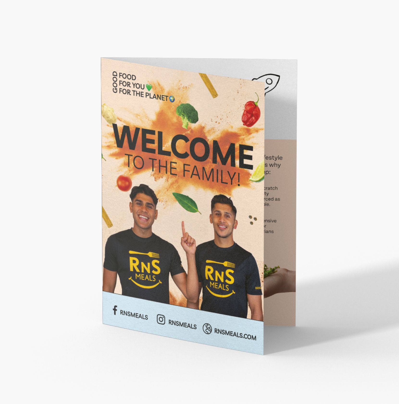
A leaflet explaining the RNS brand allows new customers to gain a full understanding of the brothers mission and the RNS family.
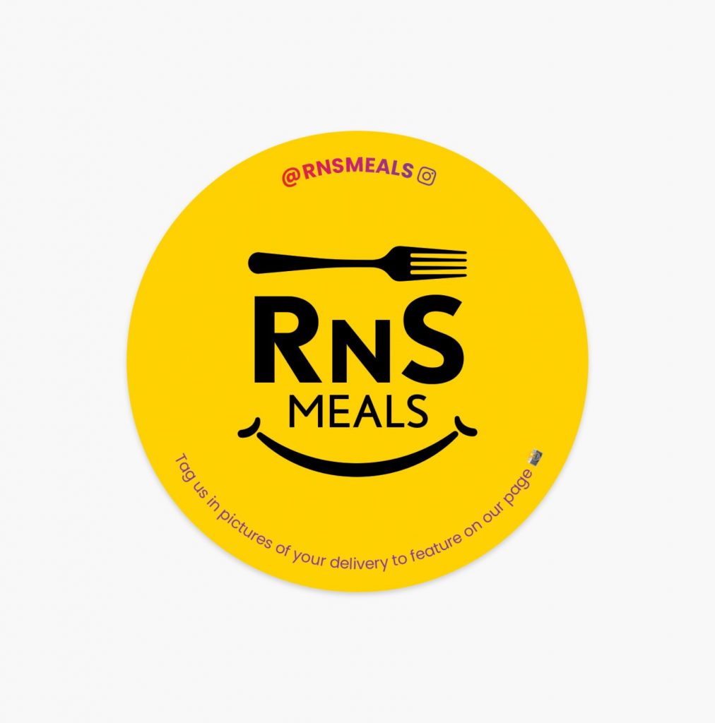
RNS stickers were created to be stuck on the bags and boxes that the meals were distributed in.
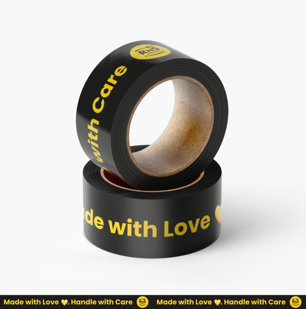
RNS tape was created to box up the packages containing the meals. It is vital to well seal the boxes to maintain insulation.
Unboxing Experience
Not just the meals!
Receiving the meals should be just as enjoyable as eating them. I focused on all aspects of the unboxing experience and created assets that welcomed new clients to the RNS family.
