Other Side Fried
Dirty done proper!
Work carried out
UX Design
UI Design
Launched in May 2019
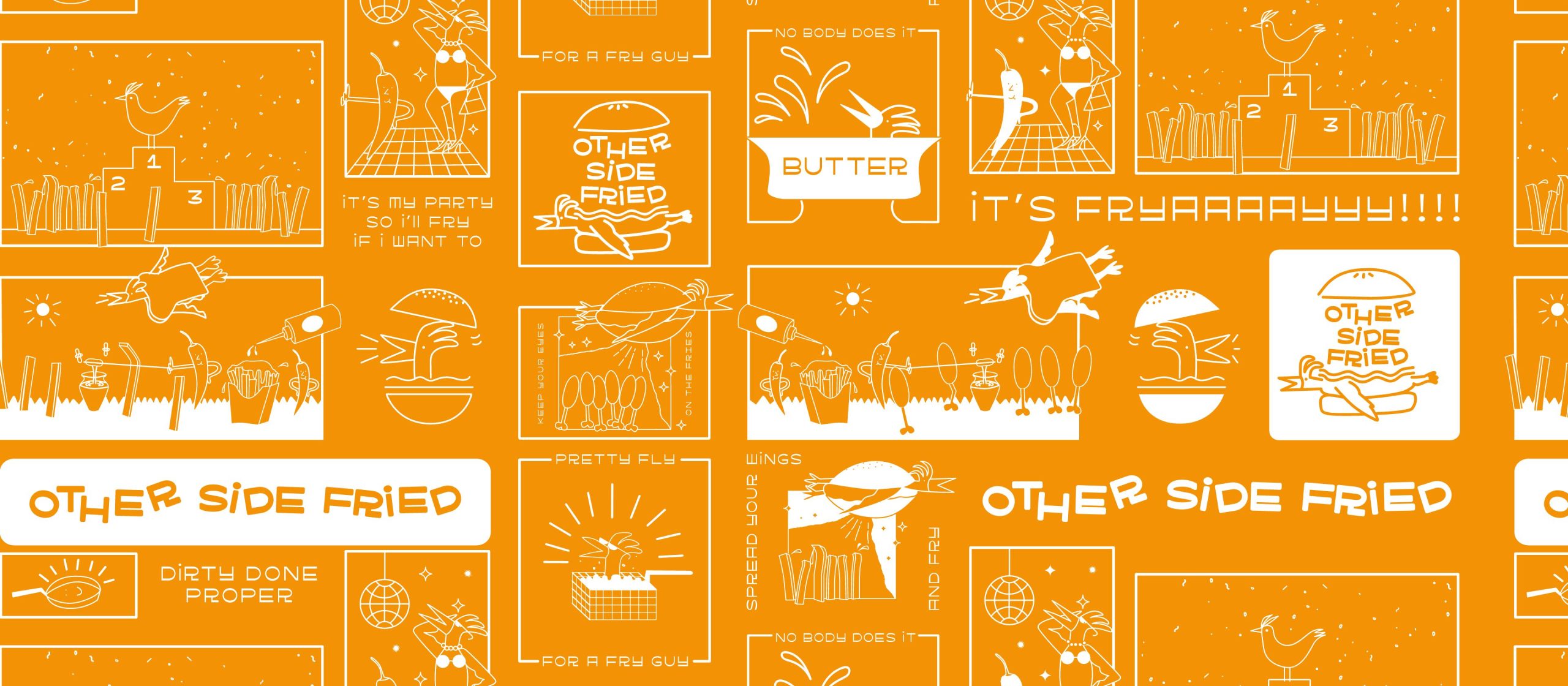
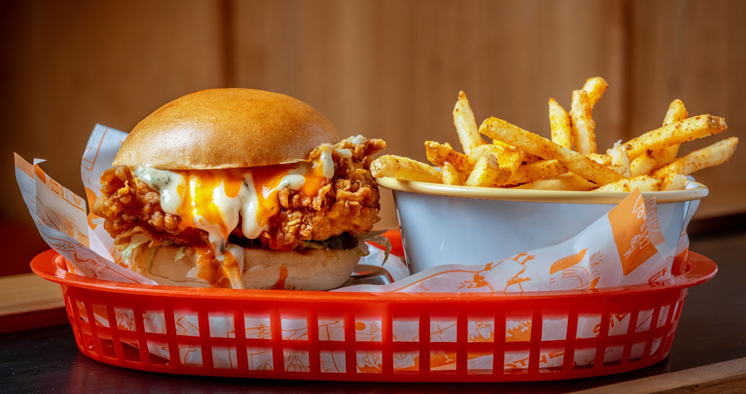
Other Side Fried is not just your average fried chicken business. With its unique approach and mouthwatering menu, it has taken the fast food industry by storm. The company’s primary focus is on serving its signature fried chicken burgers and wraps, all of which are expertly crafted to deliver a taste sensation like no other.
The brief
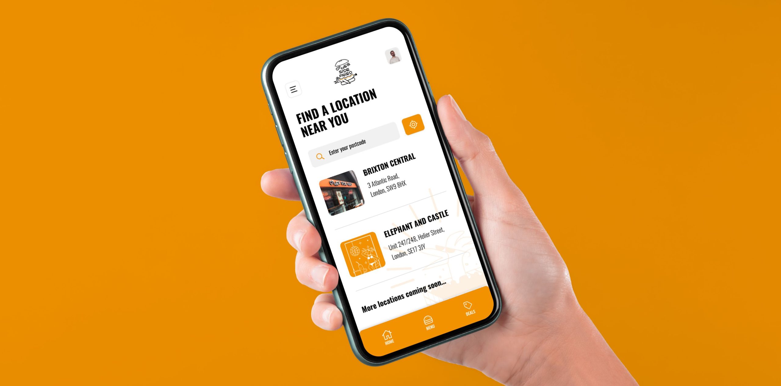
Recognising the growing importance of online ordering and the convenience it offers to customers, Other Side Fried embarked on a mission to develop a new app accompanied by an order management system. This initiative aimed to enhance the customer experience by providing a user-friendly platform that seamlessly integrated with the company’s branding.
‘God-tier’ Fried Chicken
The new app
The development process began with a thorough understanding of Other Side Fried’s brand identity. After studying the company’s existing visual elements, including its logo, colour scheme, typography, and overall aesthetic. This knowledge was then translated into the app’s interface, ensuring that it reflected the company’s branding consistently and effectively.
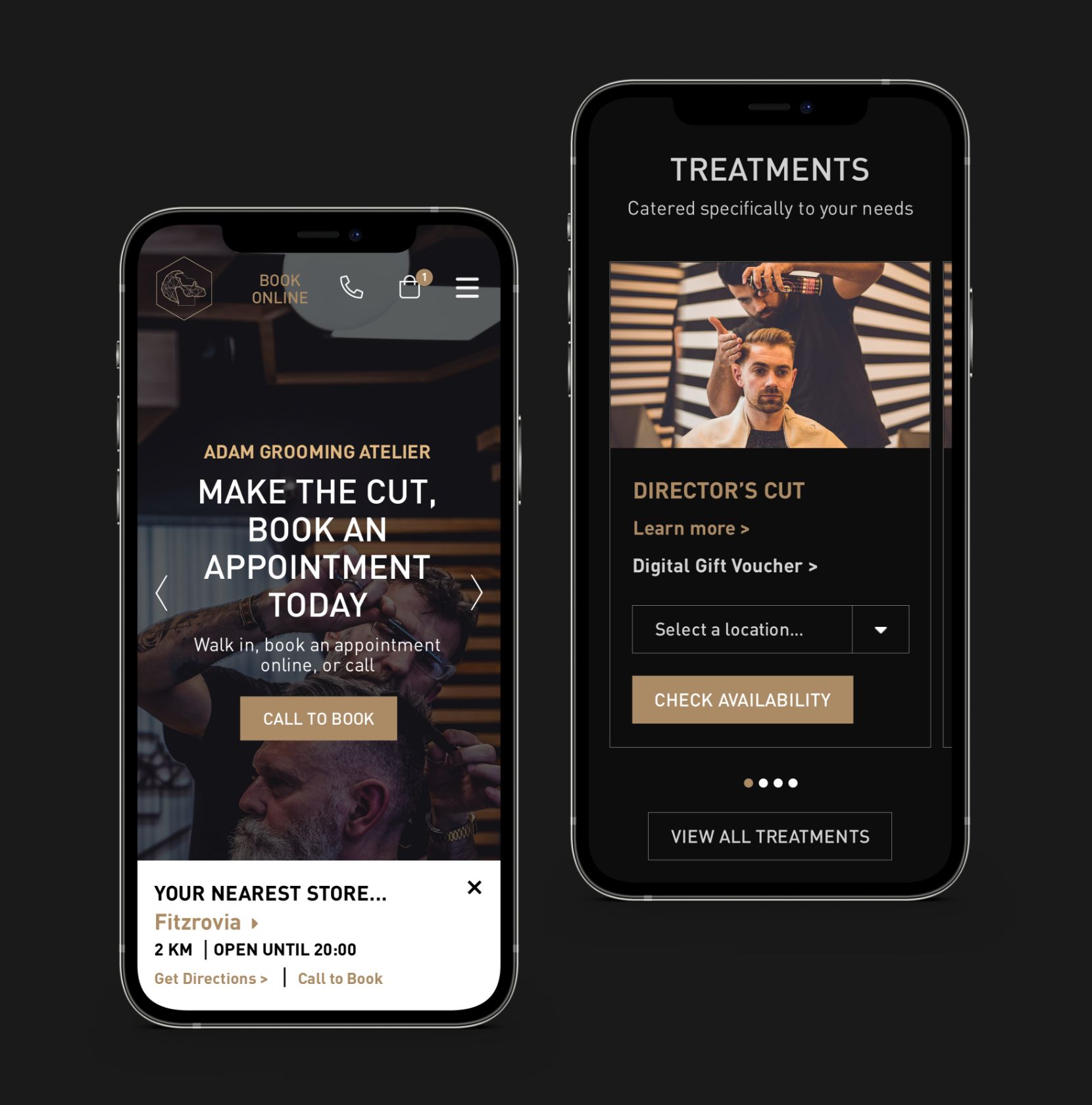
The app’s interface was designed to be visually appealing, incorporating the vibrant and energetic colours associated with Other Side Fried. The layout was carefully crafted to be intuitive and easy to navigate, enabling customers to find a restaurant nearby, browse through the menu effortlessly and place their orders with just a few taps.
Understanding the users
Who makes the cut!
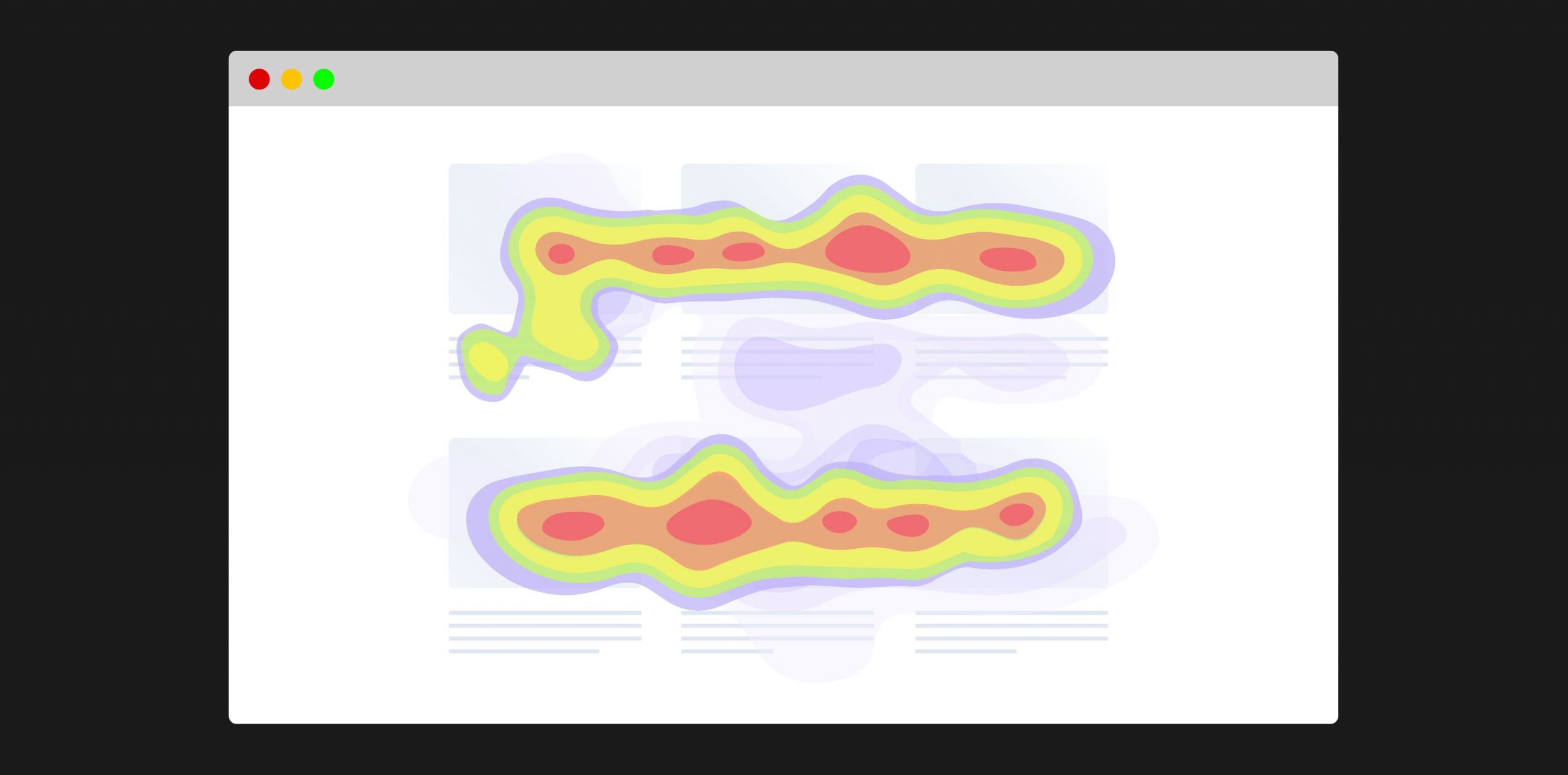
An analysis using a heatmap was conducted to examine the existing website and determine user paths and points of abandonment. By examining the journeys of users on both desktop and mobile devices, it was possible to identify specific user paths that required streamlining, as well as information that users had difficulty finding. Upon initial inspection, it became evident that there was a lack of clear distinction between purchasing a gift voucher and booking a specific haircut.
The Blueprint
Wireframing the webpages
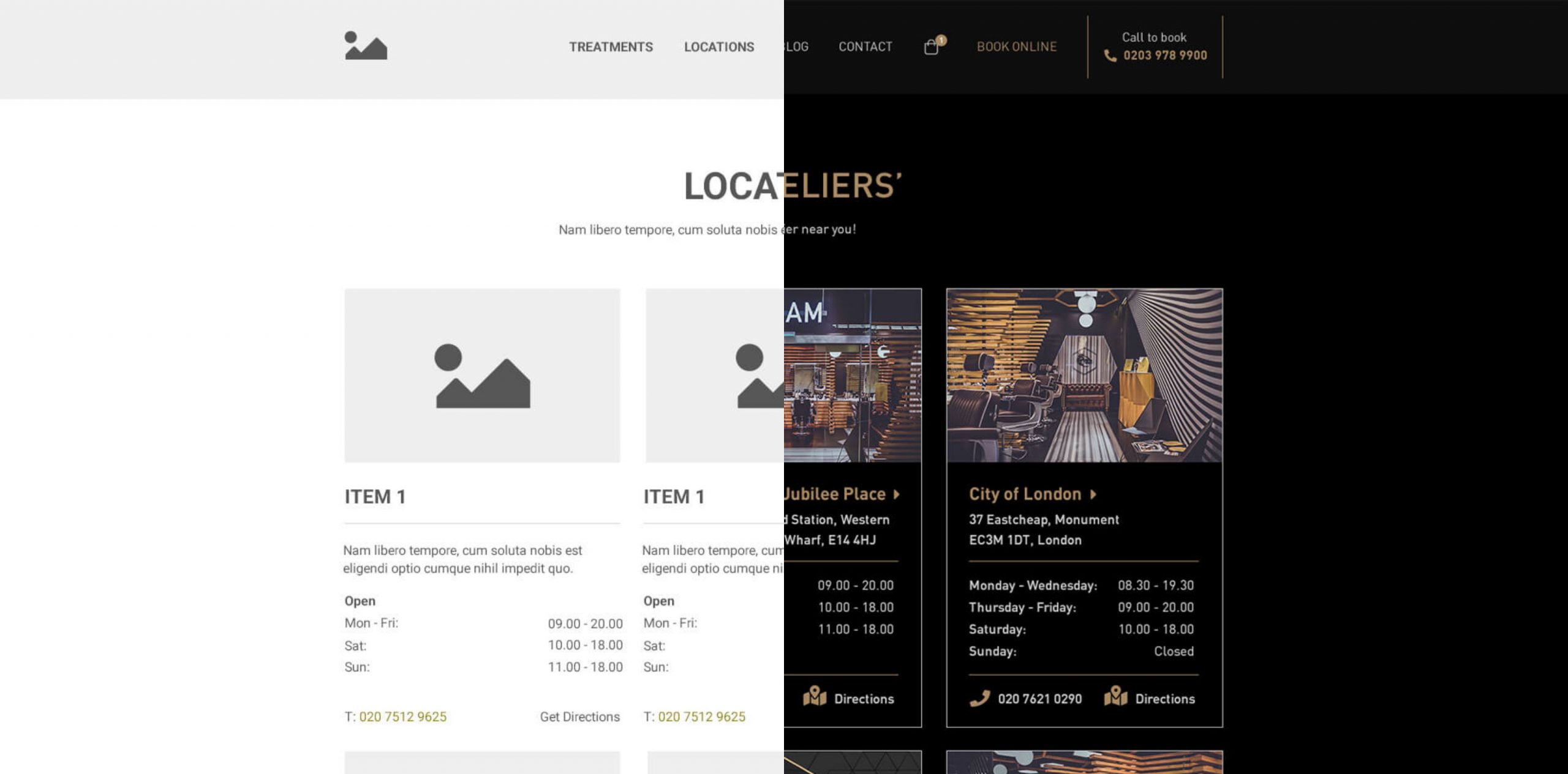
After conducting a thorough analysis of the shortcomings of the current site, a new wireframe was meticulously designed to provide a significantly improved user experience. This wireframe served as a foundation for testing and refining the newly defined user journeys, aiming to enhance their functionality. The ultimate objective was to minimise the number of clicks required for users to transition from landing on the site to achieving their desired conversion, optimising the overall conversion process.
The Adam Look
Use of imagery
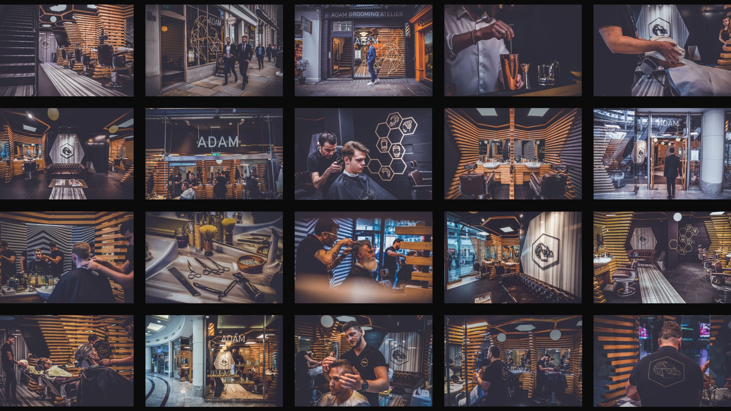
To maintain brand consistency across all media platforms, professional photographs were captured at each Adam Grooming Atelier location and subsequently utilised in all brand materials. Filtering guidelines were developed to ensure ongoing consistency. It was crucial for these photographs to not only reflect the visual identity of the brand but also embody its values and principles.
Unveiling the New Website
The finest barbering experience
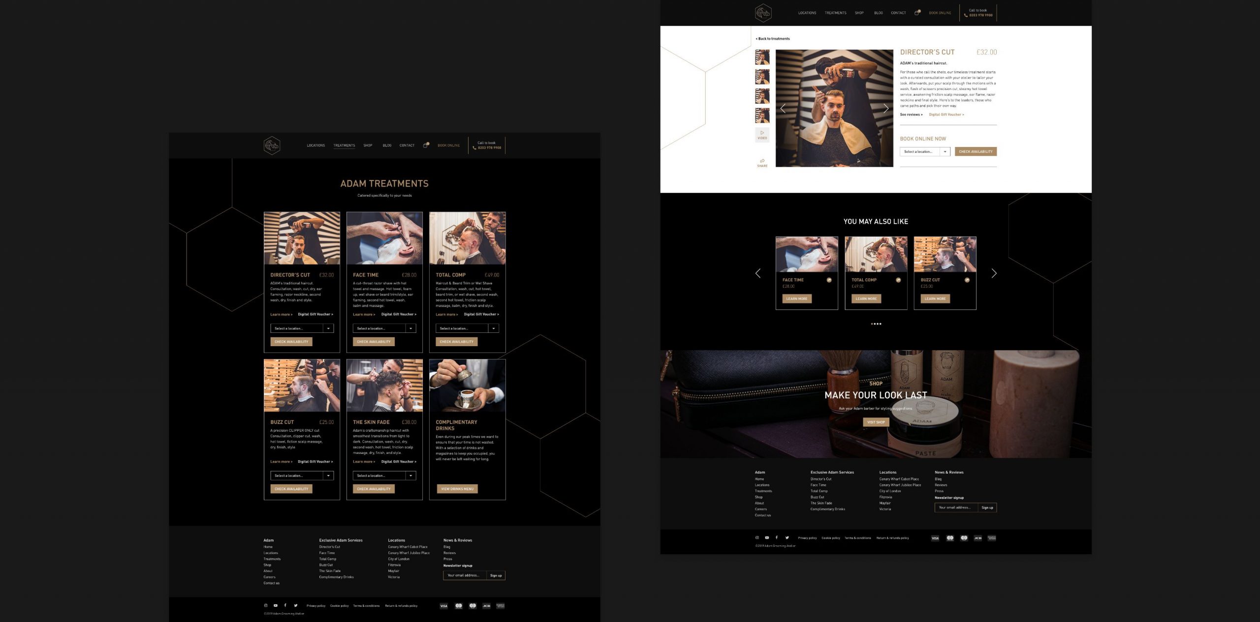
Introducing the new website designed to revolutionise your experience and boost bookings and footfall like never before. The user-friendly interface and intuitive navigation make it effortless to explore the services and offerings. With just a few clicks, you can easily browse available appointments, select your preferred date and time, and secure your booking with convenience.
Whether you’re seeking a haircut, grooming services, or a rejuvenating treatment our website ensures a seamless and efficient booking process, allowing you to take control of your schedule and secure your spot. The website serves as a virtual gateway to the exceptional experience that awaits you.
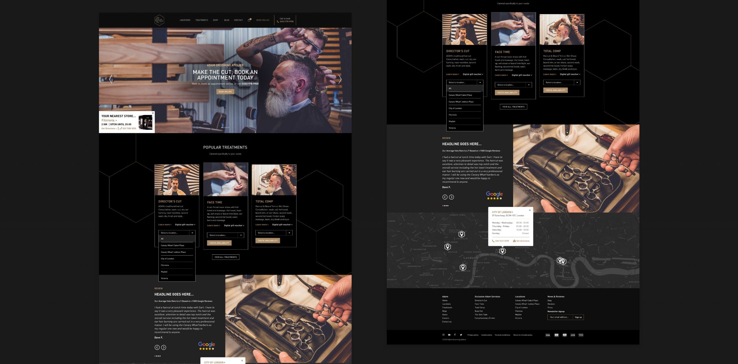
Easily navigate through a comprehensive menu of treatments and services. From haircuts and styling to facials, massages, and more, the website offers detailed descriptions of each service, ensuring you make an informed choice.
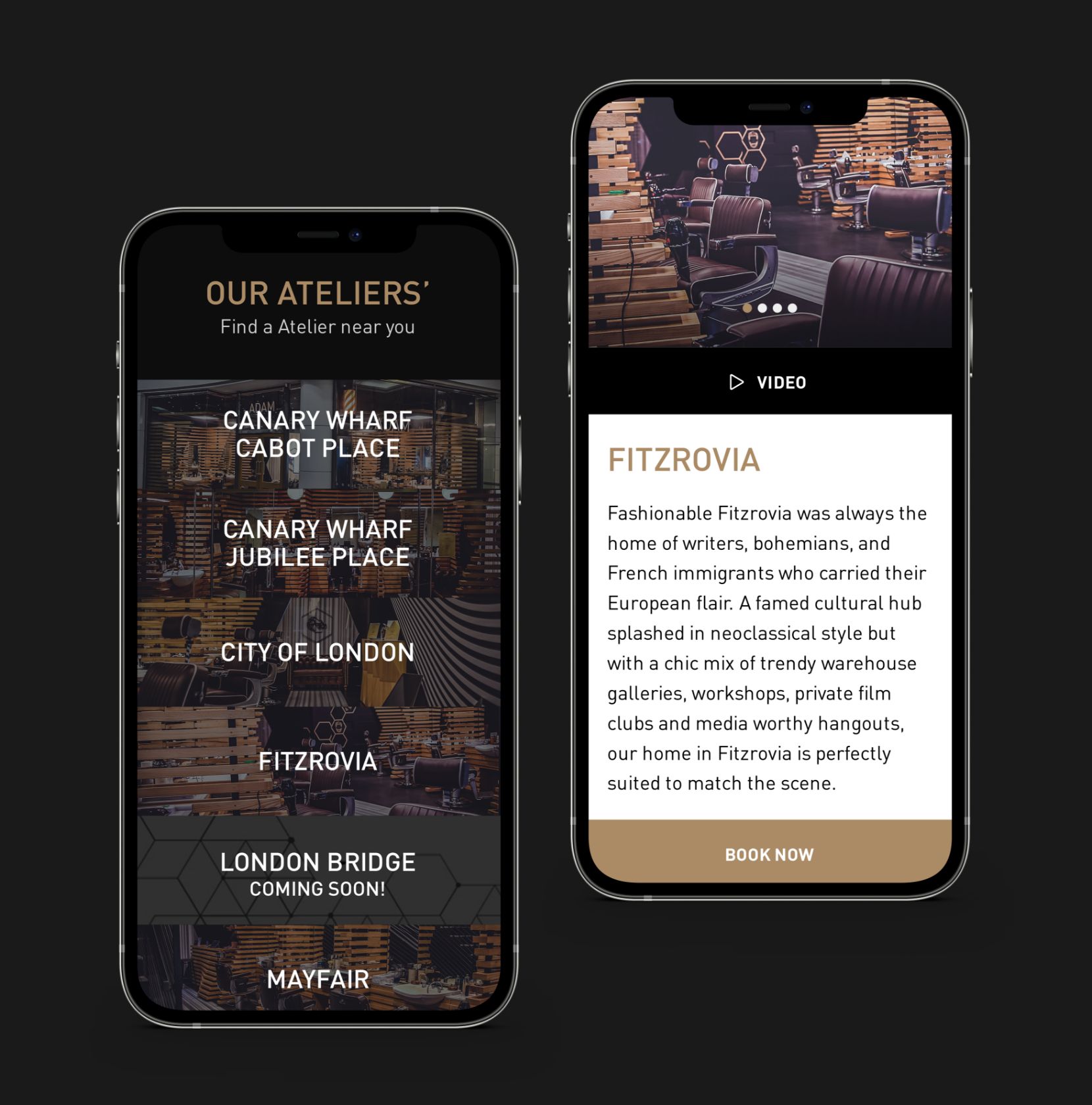
Finding the nearest atelier to you is now effortless. The website will display the closest ateliers with their addresses, contact information, and operating hours. Whether you’re at home or on the go, you can easily locate and connect with our ateliers for your convenience.
Unleash Your Style
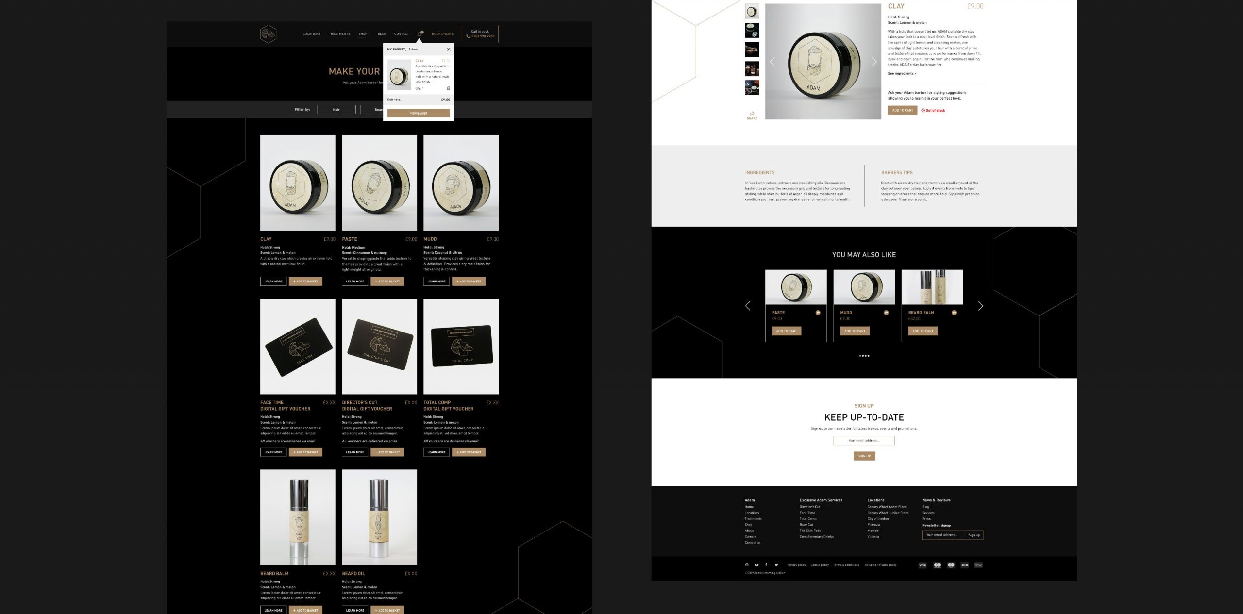
Addition of the shop
Welcome to our online shop, your gateway to an unparalleled grooming experience from the comfort of your own home. With our user-friendly website, browsing and shopping for premium grooming products has never been easier.
Discover a carefully curated selection of top-quality grooming essentials, ranging from haircare products and styling tools to beard oils, skincare items, and more. Each product in the online shop has been thoughtfully chosen to meet the diverse needs and preferences of the valued customers.
